- Our use of Goodwin's theory
- Our use of Vernallis' theory
- How we used Levi-Strauss' theory of binary opposites
- Videos that are similar and so inspired us
- Videos that are comparable because of the genre

December 16, 2010
Question 1 - In what ways does your media product use, develop or challenge forms and conventions of real media products?
After meeting to generally discuss this question we managed to break it down into seperate sections:
Question 2 - How effective is the combination of your main product and ancillary texts?
We did this in a similar way to how we did Question 1 except with the employees of Live Records Ltd.
Just to explain a little bit more about what we meant by synergy across the products, I've constructed this flowchart to show how each product links to the other.
Just to explain a little bit more about what we meant by synergy across the products, I've constructed this flowchart to show how each product links to the other.
 |
| A simple summary of how synergy works across all our products. |
Question 3 - What have you learned from your audience feedback?
From our audience feedback, we learnt that our audience is actually slightly different to what we thought it was.
Back when we were doing our treatment, we all established our ideal audience member as:
During another showing of the music video, we asked our participants to fill out our questionnaire. When everybody had left, we asked two volunteers, Rachel and Alissa to talk a little bit about themselves and their impressions of the track and music video.
With all that information, I spent an evening looking through it and creating some graphs. Here are some of the trends I found:
From this and the rest of the responses to the questionnaire, I believe that our ideal audience member has changed slightly:
Back when we were doing our treatment, we all established our ideal audience member as:
- Male or female
- 16-24
- A fan of the indie rock / emo genre
- In a band
- Styled around a specific artist
- Somebody who listens to music online
- Someone who attends their favourite band's gigs
During another showing of the music video, we asked our participants to fill out our questionnaire. When everybody had left, we asked two volunteers, Rachel and Alissa to talk a little bit about themselves and their impressions of the track and music video.
With all that information, I spent an evening looking through it and creating some graphs. Here are some of the trends I found:
From this and the rest of the responses to the questionnaire, I believe that our ideal audience member has changed slightly:
- They're 16-24
- They're male or female
- They are a fan of indie-rock, emo, punk and alternative music
- They're probably not in a band but want to be
- They listen to music whenever they're not doing anything else
- They listen to music streamed online, as well as from bought MP3s/CDs
- They'll go a tour or concert if they're favourite genre is being played
Question 4 - How did you use new media technologies in the construction and research, planning and evaluation stages?
Initial research for me mainly consisted of listening to lots of tracks on Spotify and YouTube to find songs we could have used. Then, for inspiration concerning music video, I watched some on TV channels.
Once we started learning about the theories, I analysed some music videos from YouTube to get a further understanding of how they were applied in industry. Research into album covers and websites meant using the internet a lot as well to find out what was typical of the industry.
When it came to planning, we used considerably more video than last year. Whilst I was still developing ideas for our music video, I wanted to see how practical my idea to include stop-motion was. So I used my own camera, a printer and Adobe Premiere Pro to make a short stop-motion video in a few hours. This is explained more in this post.
As well as sketching shots onto Post-Its to make a storyboard, we also took it upon ourselves to go around London in pairs to film every shot of the narrative we thought we wanted. When we came back, I spent a couple of days editing it into a visual storyboard. This was the first time we got to film footage in HD which showed us a lot of the issues that this caused despite the advantages of higher quality. More information about this can be found in this post.
When I was initially considering what our record label could be, I made some logos to go with them at home. This was done with Techsoft Design Tools, design freeware to render bitmaps in quality of 300 dpi. The colouring in itself was actually done in Microsoft Paint.
This was also the technique I used to make the logos for Cracked Headphones and No Inclination before we settled upon Erwin's Felicide as a name for the band.
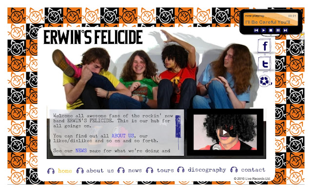
Over the half-term, I had used the internet to set up our band's three social networking sites; YouTube, Twitter and Facebook however they only really started to look professional once they had some content in the form of videos, photographs and news.
The next week mainly involved shooting the narrative on our HD camcorder, capturing in school and finding the best takes in Premiere Pro. We couldn't produce our music video much without having filmed the performance.
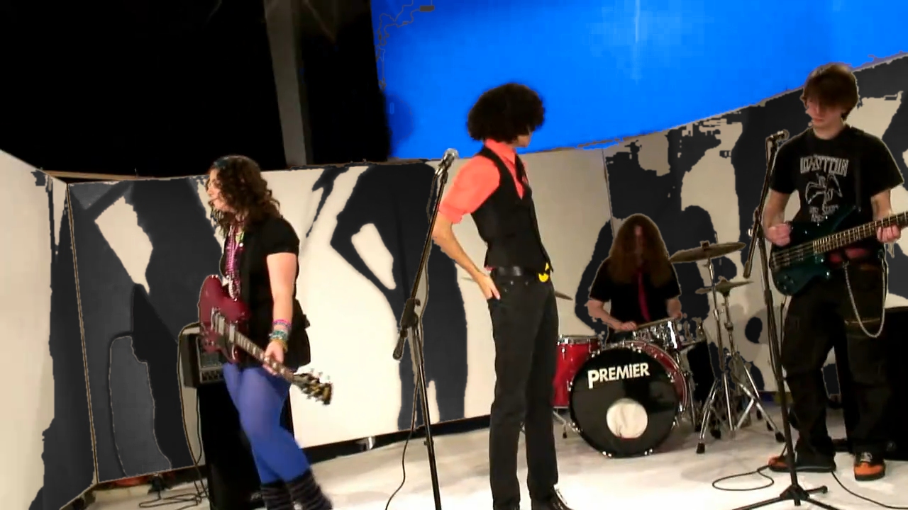
When we did the film the performance, we did get to use a lot more technology. For a start, we used the computers and specialist software to control the studio lights to create the blue background seen at the end of the video and to generally illuminate the band. We also made use of two floor lights to make bold shadows on the walls.
Also, during the performance, I took a few photographs for the website and Facebook but also I spent time operating playback which meant using my MP3 player with the track loaded on with the overhead speakers in the Seaward Studio.
During post-production, it was initially very similar to last year's post production except it took more time because:
In the production of our ancillary products, we sketched Erwin's Felicide's logo, used Paint Shop Pro to make several versions of our logo and finally exported it as a jpeg image. So that we wouldn't lose image quality in making it larger, I personally used Adobe Illustrator to convert it to a vector image. This was particularly useful in making the inside of our album cover as each cat had to be about 400 pixels wide and I would have had to extract the background manually if Illustrator hadn't done that already.
For the album cover, we only used the logo for one page but for all the others, we used photographs of our band members. During the photoshoot, we set up a three point lighting system in the Seaward studio with floor lights. By using floor lights, it was easy to illuminate our band effectively whilst creating controllable shadows on the wall behind them which we decided not to edit out of the album cover.
With the best photographs chosen, I touched them up in Paint Shop Pro and Adobe Photoshop with these 6 steps:
For the rest of the album cover,we arranged the touched up photographs, logos and text over the digipack template. The text took a little bit longer because we had to find suitable free fonts on DaFont.com. We eventually settled on Underwood Champion and Bicycle although we had to edit the text in Bicycle because the original font is outlined. As for the Live Records Ltd logo, I made a digital version of a sketch that Claire made in Microsoft Publisher because it only had to be about 100 pixels wide.
In our evaluation, we also used a range of hardware and software to make it more interesting than an essay.
For Questions 1 and 2, we used our camcorder but set to film in PAL DV because we didn't need to be high quality. In a couple of days of cutting out parts and adding print screened pictures, we just had to export it, put it on YouTube and embed it on our blogs.
For Question 2, I also made a flowchart into Microsoft Publisher which I saved as a gif and also uploaded to the blog.
For Question 3, I first used the questionnaires and Microsoft Excel to collect the information and summarise some of the questions in graph form. After print screening the graphs and cropping them in Paint Shop Pro, I made a Microsoft PowerPoint presentation to present the trends I found and uploaded it to Scribd.
For Question 4, we had to use CamStudio (video screen capturing freeware) to capture the process of rotoscoping before Claire and Wanda helped me to complete the video by narrating and acting for it. In the end this post used 3 videos that had to be embedded again and 8 pictures including the one below.
Once we started learning about the theories, I analysed some music videos from YouTube to get a further understanding of how they were applied in industry. Research into album covers and websites meant using the internet a lot as well to find out what was typical of the industry.
When it came to planning, we used considerably more video than last year. Whilst I was still developing ideas for our music video, I wanted to see how practical my idea to include stop-motion was. So I used my own camera, a printer and Adobe Premiere Pro to make a short stop-motion video in a few hours. This is explained more in this post.
As well as sketching shots onto Post-Its to make a storyboard, we also took it upon ourselves to go around London in pairs to film every shot of the narrative we thought we wanted. When we came back, I spent a couple of days editing it into a visual storyboard. This was the first time we got to film footage in HD which showed us a lot of the issues that this caused despite the advantages of higher quality. More information about this can be found in this post.
When I was initially considering what our record label could be, I made some logos to go with them at home. This was done with Techsoft Design Tools, design freeware to render bitmaps in quality of 300 dpi. The colouring in itself was actually done in Microsoft Paint.
 |
| Screenshot of how I constructed the logo using lines and geometric shapes. |
This was also the technique I used to make the logos for Cracked Headphones and No Inclination before we settled upon Erwin's Felicide as a name for the band.
Over the half-term, I had used the internet to set up our band's three social networking sites; YouTube, Twitter and Facebook however they only really started to look professional once they had some content in the form of videos, photographs and news.
The next week mainly involved shooting the narrative on our HD camcorder, capturing in school and finding the best takes in Premiere Pro. We couldn't produce our music video much without having filmed the performance.
When we did the film the performance, we did get to use a lot more technology. For a start, we used the computers and specialist software to control the studio lights to create the blue background seen at the end of the video and to generally illuminate the band. We also made use of two floor lights to make bold shadows on the walls.
 |
| Something closer to what we actually wanted to do |
During post-production, it was initially very similar to last year's post production except it took more time because:
- The sequence was longer
- There are more cuts
- Using HD footage slows down the computer's rendering abilities
In the production of our ancillary products, we sketched Erwin's Felicide's logo, used Paint Shop Pro to make several versions of our logo and finally exported it as a jpeg image. So that we wouldn't lose image quality in making it larger, I personally used Adobe Illustrator to convert it to a vector image. This was particularly useful in making the inside of our album cover as each cat had to be about 400 pixels wide and I would have had to extract the background manually if Illustrator hadn't done that already.
 |
| The evolution of our logo |
To ensure high quality shots, we used a 9.1 megapixel Sony camera on a tripod which provided us with pictures of about 4 times higher quality than they needed to be. The main problem that we had on our shoot was the actual subject of photography. Either band members facial expressions changed too much or the action was too fast to time properly (this was definitely the case with the back cover). As a result we used continuous shooting mode or the 'burst' setting on the camera to take shots in rapid succession until we got the right one.
 |
| The burst setting capturing Tom performing a forward roll. |
- Crop down to approximately the right size.
- Change curves (as seen below) to make the wall 100% whilst trying to brighten everything else up minimally.
- Use a clone brush to edit out the darker shadows in the wall created by extruding bricks, etc.
- Increase brightness and contrast to make the colours 'pop'.
- Use a noise reduction filter to smooth out textures such as peoples' faces.
- Touch up any small areas (such as Angus's cheek) with a paintbrush set to a low opacity.
 |
| The unedited photograph used for the front of the album cover |
 |
| The logo for Live Records Ltd. |
With the album cover finished, I started working on the website. This was done on the new platform, Wix. Because Wix is flash-based, we were able to do so much more than on a HTML site such as Myspace:
- There was no need to scroll down the page itself to find out information.
- There are links to everything (music video, album cover, behind-the-scenes video, Facebook, Twitter, YouTube, etc.) which can be seen without leaving the site.
- We could add special beahviours to items on the page; such as the 'About Us' photographs expanding when somebody clicks on them and text being circled or glowing if the mouse hovers over them.
 |
| Just a few of the behaviours on our website. |
For Questions 1 and 2, we used our camcorder but set to film in PAL DV because we didn't need to be high quality. In a couple of days of cutting out parts and adding print screened pictures, we just had to export it, put it on YouTube and embed it on our blogs.
For Question 2, I also made a flowchart into Microsoft Publisher which I saved as a gif and also uploaded to the blog.
For Question 3, I first used the questionnaires and Microsoft Excel to collect the information and summarise some of the questions in graph form. After print screening the graphs and cropping them in Paint Shop Pro, I made a Microsoft PowerPoint presentation to present the trends I found and uploaded it to Scribd.
For Question 4, we had to use CamStudio (video screen capturing freeware) to capture the process of rotoscoping before Claire and Wanda helped me to complete the video by narrating and acting for it. In the end this post used 3 videos that had to be embedded again and 8 pictures including the one below.
 |
| Question 4: The longest question to evaluate. |
December 8, 2010
Completed Behind-The-Scenes
After getting the footage off my own Kodak Camcorder, I've spent a few study periods editing what I filmed during the narrative and I've now finished a video showing off what happened behind-the-scenes with a few informal interviews with Angus.
This video is now on the band's website and I hope it adds some more realism to the website and the YouTube.
This video is now on the band's website and I hope it adds some more realism to the website and the YouTube.
December 6, 2010
Reflections on Project 5
Everything is almost finished!
Today, we got to export the music video to complete our production with the album cover and website.
Honestly, I'm very proud of everything we've produced for the project, especially the album cover partially because I put most of my effort into it and also because it seems the most realistic in comparison to real industry products.
Although it took a couple more weeks than expected because of the rotoscoping, I think it was worth the effort because it solved the problems of distracting colours whilst also making it look a lot more stylised.
I'm glad our project is almost finished although there's quite a lot to do:
- Host a screening to find out more from our audience
- Script, film and edit videos for our evaluation
- Create other media to complete the evaluation
November 11, 2010
Reflections on Project 4
Now that our music video footage is all captured, I really feel like it's all coming together.
To be honest, I'm really surprised at just how much footage we have to work with so I'm optimistic that we'll have a finished music video after some weeks of post-production.
As no more than two people need to be editing the music video at the same time, I've been using time in lessons to make some progress on the album cover. Unfortunately, there's only so much I can do without photographs of the band.
When the music video is done, the album cover should be done as well which means I can finally start editing the behind-the-scenes video to make the website seem more other bands' websites.
October 30, 2010
Comparison of Social Networking Sites - Green Day


- The same imagery (avatar) is used to represent the band.
- This imagery often advertises what the band is trying to sell.
- Anything important (such as a new music video) is announced on all sites.
- Fans can interact personally and are encouraged to do so.
- The band doesn't respond on a personal level to their fans.
October 29, 2010
Reflections on Project 3
The big news is that half of our music video is filmed!
Honestly, today was very tiring; to wake up at 5:30AM, be at somebody's house at 7:00AM and spend 9 hours working. I am glad though.
On the shoot, we decided to completely cancel the shots that we agreed weren't entirely necessary to ensure we stayed in time with the schedule although I think we could have shot more although I doubt much of it would have ended up in the final cut of our music video.
For the most part, the footage we got was great and we probably have enough to make an entire music video out of without having done any of the performance yet.
As it was such a long day, I did notice that everybody started to feel exhausted towards the end but we still managed to get what we needed before the sun went down.
We didn't encounter any problems we couldn't resolve, most of them were in the form of other people being very concious of the strange costumes and make-up our antagonists were wearing, one person really didn't like being filmed and a few people advised us to film in other locations although we still think that we were allowed to since it was in a public place.
As I said I would, I managed to get a few minutes of behind-the-scenes stuff filmed on my own camera and I'll edit that into a video in my own time once the performance is shot and the footage is captured.
October 28, 2010
Social Networking Sites
Over the last two days, I've been setting up a YouTube, Twitter and Facebook account for our fictional band, Erwin's Felicide. Currently, I need to discuss with the group what colours and themes they should all have but this is just how I've temporarily styled them:


October 27, 2010
Record Label Ideas
After looking through a list of independent UK record labels for inspiration, I have come up with 2 ideas for our band's record label based on the fact they would probably specialise in producing alternative music:
 |
| Re-Recorded Records |
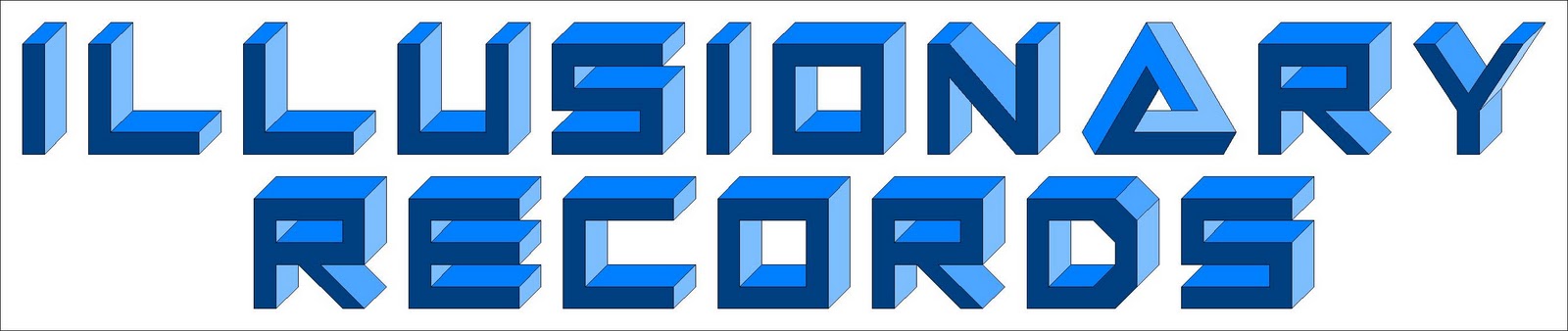 |
| Illusionary Records |
October 24, 2010
Website Key Imagery Ideas
 |
| "Photos" page: Band members throwing Polaroids in the air which link to larger images. |
 |
| "Bios" page: Each band member gets a quarter of the page, a 30 second video interview and a short paragraph of information. |
 |
| Banner at top: Band members interacting with a bar code. |
October 22, 2010
Our Two Storyboards
To give our actors and ourselves an idea of what we want to achieve on next Friday's shoot, we drew up this storyboard.

In addition to this, we also did a second reccie in London to find specific shots to take. In pairs, one of us filmed whilst the other one acted as if they were an antagonist or Angus or both. Recently, I've been editing the footage from this reccie into a sort of "filmed storyboard" after overcoming several technical problems with the fact that we were using HD footage. The actors have all just seen this and I've advised them to watch it again to make sure they get an understanding of what's expected of them next week.

October 20, 2010
Potential Website Fonts
As we're starting to think about our website's design elements, we've decided to post any ideas about fonts to use on the website. Here are my 3 suggestions:
I chose this font because it relates to our idea of a bar code in that the edges are geometric and square and the letters have a fixed width. Additionally, unlike quite a few fixed width fonts, it is still easy to read.
I think a 'destroyed' font such raises some connotations of aggression and anarchy which are both associated with the rock music genre. The reason I chose this particular 'destroyed' font is because it has a lower case alphabet and it's not destroyed to the point of it being illegible.
Partially inspired by Nirvana's band logo, I think a formal serif font would do a good job of subverting the genre conventions of aggression, etc. that I mentioned above. This should help brand our band as an alternative to the typical. Furthermore, it ties in with our idea of styling the band's costumes in a formal fashion. Bodoni XT does a good job of being more formal than most serif fonts and it looks good in most sizes.
 |
| Jack Input |
 |
| City Burn |
I think a 'destroyed' font such raises some connotations of aggression and anarchy which are both associated with the rock music genre. The reason I chose this particular 'destroyed' font is because it has a lower case alphabet and it's not destroyed to the point of it being illegible.
 |
| Bodoni XT |
October 18, 2010
Behind-The-Scenes Videos Analysis
Over the half-term, when we're filming the narrative part of our music video, it would also be a good idea to make a "Making of" or "Behind-the-scenes" video which we can place on our website as other artists have done in the past. A few of these videos are below:
By watching these, I have found 9 conventions to have in mind when I'm filming / editing our behind the scenes video.
- Feature the music of the music video
- Showcase how fun it was to make the video
- Usually about as long as a music video
- Edited in chronological order of filming
- All cast and crew acknowledge camera
- Focus on the artist or director
- Cutaways to what was being filmed
- Shows the process but doesn't explain
- Longer takes than a normal music video
October 15, 2010
Album Cover Ideas

 This album cover is inspired from a scene in "Inception" where gravity shifts yet everybody is unaffected. Recently, I managed to photograph something similar with objects on a desk so I have several ideas of how to do this practically with real people. Should we be unable to get our band to lean against something and remain composed then we use a fan to blow them from the side or invisible thread to pull their clothes sideways. What makes this a good album cover is that it plays on the convention of showing the band but has them in a quirky position.


Inspired from a magazine cover (see right) advertising Portal 2, I thought it would be a cool concept to create the illusion of transparency in the album cover. The front would be of the backs of the band members pointing up at the album name. The back would be of the fronts of the band members pointing up at the track list. Again, this works by subverting the convention of showing the band's friendly faces on the front.
October 11, 2010
Music Video Making Tips
From an article in "Media Magazine", I have found some great tips that I think we should remember when it for the planning, shooting and editing stages of transforming our idea into a music video:
- We need to plan a lot, especially since the narrative part of it takes place in many different locations with several actors. This means we have to design a schedule factoring in things like transport issues, setting up the camera / lighting and so on.
- As well as this, we should really need to make a call sheet with contact details, locations, etc. Hopefully between now and half-term, we'll have had enough meetings with our cast and crew to get all the information we need.
- We need to know what to film, after having another, more refined reccie this weekend in our 5 main locations, we should be able to write up a shot list with a few photographs / videos showing exactly where we want to film from.
- Around about the same time we're creating our schedule, we have to make a storyboard that clearly shows our actors and crew what we want to film. As we're filming outside, it will have to be durable and portable.
- Although, we have most of them, we'll have to secure all of our props and costumes prior to the shoot.
- By the shoot, we'll also have to find a way to playback the music on demand in a way that is loud enough for the performers to hear but also with the capability for it to play loud enough for the band to lip-sync to it without feeling embarrassed.
- Ensure the camera is set for the best video quality. This means using manual focus if necessary or a different white balance to give the video a sense of 'warmth'. Also, the ensure the depth of field / exposure are good then the aperture and shutter speed may need to be customised.
- Check the tape regularly to make sure the footage recorded properly and that nothing has to be shot again.
- Shooting more than you planned can be extremely useful for cutaways in the editing.
- When we finally capture the footage, we should split up the clips and name them to make it easier to work out where everything fits into the sequence.
- We need to plan which special effects we're going to use if any and not just add them to create the entire music video.
- Avoid long shots and cut a lot of times, this is also why we need to film a lot of different shots on the actual shoots.
- Work to ensure our material is lined up for lip synced before anything else, in our case, the narrative.
- Apply filters to make sure the footage looks consistent.
- Consider transitions, cuts are advisable but perhaps fades could be good at other parts in the sequence.
October 7, 2010
Website Notes
Although, we're not doing this until after half-term, I think we should think about our website, specifically how it should have the following:
- A theme (related to the album cover art running throughout on the background, icons, etc.
- Photographs and videos of the band such as the music video, behind the scenes, our competition, wallpapers, etc.
- One or more media players to show the videos or perhaps a slideshow of pictures.
- Opportunities for the audience to buy into the band such as a merchandise store or a link to their iTunes.
- Ways for the audience to communicate with the artist such as a comments section, social networking sites, e-mail button, forum and so on.
- Information about the band / individual band members (which would really work with our idea to give each member a different 'scene')
- Details of upcoming performances (at small gigs around London, e.g. Covent Garden, "Rough Trade")
October 4, 2010
Reflections On Project 2
The last 4 days have been very busy concerning this project...
Friday
On this day, we went around London from 10:30 to about 17:00, to find and inspect possible locations to film the narrative aspect of the music video on. I believe that today was incredibly useful, because it's one thing to look up places on Google maps but it's another to actually hold the camera in position and safely say that it would be a great place to film. Below are just some of locations we're considering.
Saturday
On this day, Wanda and I held a test shoot with some of the cast to be in our music video. Initially, we photographed two of our four potential band members.
Then, we made them practise lip-syncing and guitar-playing respectively in front of the camera to assess their suitability. In my opinion I think that they'll both work in the band but that they really need to know the track otherwise it's not going to look at all convincing. As Angus is the lead singer of our band, I think we need to have another lip-synch with him.
Afterwards, we got some friends to try out our antagonists' costumes so we'd know what it would look like on a person. Personally, I like the concept although it seems too conventional for villains. It's typical for them to wear black, hoodies, etc. and they honestly seem more like muggers than figments of our protagonists' imagination. This is one area that needs to be adapted in my opinion though I'm not sure what I'd change about them.
Sunday
For a few hours at Kerry's house, Kerry, Claire and I worked out the details of treatment that we weren't sure of as a group. We also went over the information that had to be in the treatment so that me and Kerry could pitch to the class on Monday and got some more ideas as to what other things we could include such as pictures on the handout and video on the blog.
Monday
We finally finished the handout and I think we can be quite proud of it:
Friday
On this day, we went around London from 10:30 to about 17:00, to find and inspect possible locations to film the narrative aspect of the music video on. I believe that today was incredibly useful, because it's one thing to look up places on Google maps but it's another to actually hold the camera in position and safely say that it would be a great place to film. Below are just some of locations we're considering.
Saturday
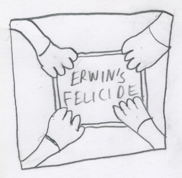
On this day, Wanda and I held a test shoot with some of the cast to be in our music video. Initially, we photographed two of our four potential band members.
 |
| Angus and Izzy trying out our initial costume ideas. |
Afterwards, we got some friends to try out our antagonists' costumes so we'd know what it would look like on a person. Personally, I like the concept although it seems too conventional for villains. It's typical for them to wear black, hoodies, etc. and they honestly seem more like muggers than figments of our protagonists' imagination. This is one area that needs to be adapted in my opinion though I'm not sure what I'd change about them.
Sunday
For a few hours at Kerry's house, Kerry, Claire and I worked out the details of treatment that we weren't sure of as a group. We also went over the information that had to be in the treatment so that me and Kerry could pitch to the class on Monday and got some more ideas as to what other things we could include such as pictures on the handout and video on the blog.
Monday
We finally finished the handout and I think we can be quite proud of it:
- It gives all the necessary information
- It's quite easy to find any specific information you want
- It's simple to understand
- It's visual with our use of photographs, illustrations, lyrics and flowcharts
October 3, 2010
Summary Of Album Art
The challenge of an album cover is that it has to do so much with such limited space:
- It has to stand out amongst other CDs.
- It has to be memorable.
- It has to suggest the genre of the music.
- It has to have an iconic and original image.
- It has to sell the artist behind the music.
- It has to have a constant concept running throughout.
- It has to instantly have an impact in the audience.
- There are many different features of album covers but the 8 most relevant ones are:
- A good album cover has the right combination of following and subverting conventions.
- Modern album covers may be 'post-modern' or have referential or ironic qualities.
- Some album covers attempt to shock or surprise the audience.
- They use colour and language to relate to everything mentioned previously.
- An artist's first album is typically named the artist.
- It may be useful to base the album cover on something else to link the two in the audience's mind.
- Elements of the album cover may suggest the theme of the album without illustrating it.
- Because of digital music consumption, it has to understandable when it is made smaller.
September 30, 2010
Reflections On Project 1
After 3 meetings in the last week and half of our pitch on Monday; I'm feeling confident.
Beforehand, I had my doubts that we were going to be prepared because of group members being absent or busy, etc. but now that we've all talked together (even though it was by phone) and discussed the plan for this weekend, I really think that we can pull it off.
The current plan to shoot location reccies on Friday at 10AM is good idea although I do think we should split up into two pairs. This way, we get more done faster than as a whole group and we can give each other ideas for things to shoot.
I have a few doubts about our actor shoot on Saturday because actors may not be too prompt or reliable although I’m remaining optimistic.
As for our presentation of our treatment on Monday, I think that it will go well if we can do our designated tasks on the weekend and compile it on Monday at lunchtime or in a study period.
September 26, 2010
Possible Band Names
After thinking about the upcoming treatment, I realised that our band doesn't have a name. Consequently, I came up with a few ideas for potential band names and made some draft logos:
The Wires
Cracked Headphones
 Anderer Alternativ (German for 'Another Alternative')
Musichaters
In Glend (quirky spelling of England)
No Inclination

The Wires
Cracked Headphones

Musichaters
In Glend (quirky spelling of England)
No Inclination

Marketing Case Study - Weezer
The point of a marketing campaign for an artist to generally maximise their income potential. This is because it creates an awareness of the artist / record label; helps to sell tracks, tickets and merchandise in general; to create the artist's brand identity; and gives audiences a preview of the band so that they want to buy into the band.
As Weezer is a signed and popular band, I believe there are 3 main sources of income that they get to fund their marketing campaigns:
Clearly, their genre of music and target audience is very relevant here. As an alternative rock band, they have a large audience of 13-24 year olds. As this audience frequently uses the internet for various reasons, they have a lot of online marketing such as internet adverts, the "YouTube invasion" and the media on the website. As an alternative band, a lot of their marketing has also been quirky, especially when you consider their album cover design:
As Weezer is a signed and popular band, I believe there are 3 main sources of income that they get to fund their marketing campaigns:

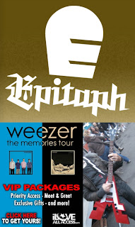
- Epitaph Records: their record label should give them large advances based on their popularity and therefore, their income potential which should be boosted by a marketing campaign.
- The Memories Tour and other live performances: since the rise in streaming and downloading music for free; there has been a decline in track sales; consequently a larger percentage of income has come from ticket sales from fans who would rather pay for that than an album.
- Endorsement: in most photographs I found of the band, I discovered that they get given customised instruments (such as the one pictured above) to play. Additionally, they have formed partnerships with other companies such as YouTube (where they post their videos) and Bravado (who creates their merchandise).
- The band has the usual features of a modern music marketing campaign; music videos, album cover, website, updates on social networking sites, radio play (on BBC 6 Music), merchandise, live performances, reviews, etc.
- What makes Weezer's marketing campaign unique is their "YouTube Invasion". Recently, they worked with 15 different popular YouTube videomakers to create 15 videos featuring the original artist and the band.
- Below is just one of their collaborations, this one with "The Key Of Awesome"; a 'show' that produces comedic music videos weekly.
- This campaign allows the band to have a good marketing mix: they reach a large international audience but also narrowcast to fans of those paticular shows.
Clearly, their genre of music and target audience is very relevant here. As an alternative rock band, they have a large audience of 13-24 year olds. As this audience frequently uses the internet for various reasons, they have a lot of online marketing such as internet adverts, the "YouTube invasion" and the media on the website. As an alternative band, a lot of their marketing has also been quirky, especially when you consider their album cover design:
 |
| Jorge Garcia (AKA Hurley from "Lost") is the main image on the album cover, "Hurley" |
Website Case Study - Weezer

On September 14th, Weezer released there latest album, "Hurley".
There are currently under the Epitaph Records label. They are an independent record label who are currently behind artists such as Alkaline Trio, Off with Their Heads and New Found Glory. This shows that Weezer is with a record label that works specifically with pop punk / alternative rock artists which both reflect their genre of music but also creates opportunities for them to collaborate together.
The website benefits the band in several ways but the five most important ways are:
- It raises awareness of Weezer and "Hurley"
- It promotes the band's upcoming tour and other live performances.
- It constructs the artist's brand identity.
- It appeals to the target audience.
- It provides a platform for them to sell their music and more.
On the website, there are many signifiers concerning the way in which Weezer brands themselves. As they are an alternative rock band, they have gone against the convention of showing themselves, the main imagery is that of Jorge Garcia (Hurley from "Lost"). The band is also trying to brand themselves as being very friendly by showing fun candid shots of themselves and allowing their target audience to engage with them and other fans on a higher level.
From four different sources, I believe I can say who is Weezer's target audience:
- Google Trends - The USA and Canada are looking up Weezer the most which suggests they have more fans in those regions.
- YouTube - From the official video for "Memories" from "Hurley", it confirms that they are targeting an North American / Canadian audience (see below - darker regions are more popular). Additionally, it shows that their audience is mixed gender although mostly male and that they are popular with 13-24 year olds.
- Social Networking Sites - From looking at the band's Facebook likers, Twitter followers and Myspace friends, I see that this confirms what I thought about their audience's age and nationality although it seems there seems to be more gender balance here.
- Members of Weezer.com - Here, I see that their target audience is definitely composed of 13-24 year olds however they seem to be a lot more popular in America than Canada. This may be because they are only touring in the USA right now.
| Where to people who watch "Memories" come from, where darker areas indicate more popularity. |
To appeal to their young target audience, they do many small things but the main thing is that they allow the audience to interact in these 8 particular ways.
- The website actively encourages that fans sign-up (banner at top says "Sign Up" / "Sign In"; banners on the side of the page say the same;
- People who sign up can create their own page with status updates, information, etc.
- Additionally, they can communicate with other fans through the website's forum or use the chat option to talk to people in real time.
- Anybody signed up can upload pictures or videos relating to Weezer (taken at concerts, fan art, themselves wearing the band's merchandise, etc.)
- Visitors of the site can add the band on Twitter, Facebook, Myspace, YouTube or through RSS feed. Also, all of the band members have a Twitter or Myspace.
- Anybody who visits the site can listen to their latest single and watch videos / view pictures.
- Anybody can buy tickets for the band's tours, performances, festivals, etc.
- They can buy merchandise from the site's store such as the usual t-shirts, CDs and posters but one unique thing to Weezer is that you can buy a Snuggie because of the popularity these received on the internet (around about the same time they had a success with their viral hit, "Pork and Beans")
 |
| The Weezer Snuggie |
Besides the methods previously mentioned, the band and album are marketed with adverts such as the large banner across the top of the page and a few on the sides; people can embed badges (see below) into blogs, signatures, etc.
Apart from the artist and their products not much else is being publicised on the website. A few exceptions are:
- The band's "unofficial fifth member" / their webmaster, Karl Koch
- The venues of their performances
- Other similar artists on the embeddable 'radio' (see below)
In terms of reaching their target audience, many things are important however, the top NUMBER are:
- The internet. Not just because of their website, but also through social networking sites that their audience uses and the fact that they gathered a significant internet following after their single "Pork and Beans" went viral on YouTube.
- The charts. Based on information on Google Trends, they were most popular in the second quarter of 2005. This is because of their album, "Make Believe" which peaked at #2 in the USA and #1 in Canada.
- Other artists. By looking up information about other similar artists such as The All-American Rejects, Deftones and Dashboard Confessional, I have found that they all cite Weezer as an influence to their music. Additionally, Weezer has has live performances with many popular artists in the past including Blink-182, Klaxons and Foo-Fighters.
- Music television. Although I think that this is due to Spike Jonze's popularity, Weezer has had several music videos with a lot of play on music television channels (even today). These include "Buddy Holly", "Undone - The Sweater Song" and "Island in the Sun".
September 25, 2010
Directorial Style - Michel Gondry
One of my favourite directors, even before I started this project has been Michel Gondry. After watching most of his music videos, I have chosen six very different videos that I both really like and think epitomise his style.
From left to right, top to bottom, these are music videos for:
"Mad World" - Gary Jules
"Let Forever Be" - The Chemical Brothers
"Walkie Talkie Man" - Steriogram
"Knives Out" - Radiohead
"The Hardest Button to Button" - The White Stripes
"Around the World" - Daft Punk
From watching these and more videos from Gondry, I believe I have found some similarities that create his overall directorial style.
- Use of stop-motion, often with live-action people.
- Movements and editing put heavy emphasis on the beat of the music as opposed to the lyrics.
- Videos based around a surreal concept and sometimes performance.
- Very abstract use of mise en scène.
- Fond of long takes.
- Frequently set in familiar locations but with an unusual twist.
- Often manipulates time in editing.
- Usually require a lot of choreography and planning.
In our project, I would really like to incorporate some similar elements although I appreciate that we can't recreate any of his work.
September 22, 2010
Stop-Motion Test Shoot
Because one of my ideas for a music video for the track "One Week" is rather complicated, I think that it would be a good idea to test it out to see if it is possible to incorporate it into the music video. Here is my tutorial for shooting stop-motion animation with photographs.
In making these test videos, I have learnt several things to do if we do decide to use stop-motion in our project:
- Film the subject of the stop-motion. From experience, I know that this should be done at a higher shutter speed than normal (in my case, 60 fps) to reduce motion blur in the next stage.
- Take stills from every Nth frame in the video. N can be worked out by using N=F/(P/2) where F is the Frames per second that the action was filmed at (60) and P is the Project's frame rate (24).
- Print off the stills. For every second of stop-motion you want, print off P/2 stills (12).
- Take two photographs of each still. Each pair of photographs should be as identical as possible, this is just done as opposed to slowing down the video so that it looks smoother.
- Edit the photographs together. In the project, each photograph should only be shown for one frame. In theory, this should create a stop-motion animation with photographs without too much effort.
- The original unedited footage of the drum I used to test this out.
- Test with printed out stills of that footage photographed whilst moving the camera in to transition back into the original footage.
- Test with printed out stills again but not moving the camera as much and not making the original footage cover the whole screen.
- Test by taking stills from the original footage and showing them for more than one frame in editing.
In making these test videos, I have learnt several things to do if we do decide to use stop-motion in our project:
- When I imported the original footage into the project it fixed the frame rate for me so I just had to print off every other still.
- Printing off stills and taking photographs of those makes this project longer and more expensive as we would have to get them printed in high quality (for at least 9p each).
- It is a lot easier to take photographs and add those directly to the timeline or to edit high speed footage so that it looks like stop-motion.
- If photographs are going to be used, they should be taken with a good camera, if focus or exposure changes, it will be very obvious.
- There should not be very much movement between two frames of stop-motion; if the action and the camera both move, it will look very shaky and bad.
September 21, 2010
My Group
Yesterday, we got put into our groups for Media!
I'm very pleased with my group of Claire, Kerry and Wanda; from experience I know that Kerry is great to work with and having heard some of Claire and Wanda's music I think that our genre tastes are rather similar so I think that we're going to make a good team.
I'm very pleased with my group of Claire, Kerry and Wanda; from experience I know that Kerry is great to work with and having heard some of Claire and Wanda's music I think that our genre tastes are rather similar so I think that we're going to make a good team.
September 17, 2010
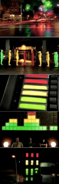
Vernallis Analysis - Daft Punk Is Playing At My House
Daft Punk Is Playing At My House - LCD Soundsystem
This music video applies very well to all four aspects of Carol Vernallis' theory.
Narrative
The narrative is very fragmented, by what I can gather, the narrative is that there is a very good DJ (not necessarily Daft Punk) performing for a party at somebody's house. This video is also very fragmented as it keeps changing location between the city streets and the house. Also, this video utilises a lot of interesting visual effects like stop motion and slow shutter speeds to create more distortion of narrative.
What drives the video forward is the music and the performance of the artist / host of the party, the partygoers and the 'traffic light people' act around the music (see Diegesis for more detail). The video's ending doesn't really resolve itself. All we know is that the party is now over, the 'traffic light people' take the
host outside and then it ends.

This one music video poses a lot of questions that it doesn't even begin to answer, including:
- Who are the 'traffic light people'?
- What is happening at the party?
- Why does the host keep going out into the city?
Editing
In this music video, most of the editing is done to match the music. The actual cuts between set-ups are matched to the lyrics. Although this may fall under Camera, a lot of the camera movements have been sped up to match the beat of the music. Additionally, a lot of the stop-motion with the 'traffic light people' also matches the music in the same way as the lights on the mixing desk.

Although a lot of music videos have obvious editing because of their lack of continuity, this one in paticular foregrounds the editing by using a range of visual effects such as stop-motion, speeding up footage and adding motion blur.
As mentioned before, this video breaks many of the rules of continuity:
- There are many jump cuts that break the 30 degree rule.
- Occasionally, there are cuts in the middle of lyrics.
- Extreme jumps in space are common in this video.
- Transitions are not smooth.
- Extreme shots are juxtaposed.
Camera
For this paticular aspect, Vernallis' theory is very applicable in three ways:
1. Extreme close-ups and master shots are both common in the video.

2. The camera moves in time with the music throughout the video. For example, at the beginning, the camera pans across a city, stopping on the beat.
3. The fast-paced and rough style of movement is distinctive to this video.
Diegesis
The world of the music video is revealed relatively slowly by showing various shots taken around an urban environment. Actions are very broken up by the blurry camera-work but they are also interrupted by cutting to other actions. Most movements of the people in the video are done to the music, especially those of the 'traffic light people'.
As previously mentioned, there are frequent jumps in space and time which create gaps in the audience's understanding. For example, the beginning jumps from the mixing desk inside the house to a city street at night to a set of traffic lights back to the city street to a building under construction to the traffic lights again and so on.
Some frames are emphasised by the movement stopping whilst the ones around it are blurry, e.g. when the party guests stop dancing. Throughout the video, there are repititions of the beat, lyrics and performance but more unique to this video, the colours of red, yellow and green are repeated.

September 16, 2010
Goodwin Analysis - Never Miss A Beat
Never Miss A Beat - Kaiser Chiefs
Video directed by Goodtimes
This music video from the Kaiser Chiefs uses a track of indie-rock genre as shown by:
- Band wearing ordinary clothes
- Filmed on location as opposed to a studio
- Extras don't appear to wearing costumes (besides masks)
- Overall production value looks low
- The way the band performs the song

A few times in the video, the lyrics are illustrated by the visuals, for example:
- During the line, "Television's on the blink...", the visuals are of a malfunctioning television.
- At the beginning of the line, "Here comes the referee..." referring a to policeman, we see one on screen.

In the music video, most of the cuts are done to the beat, especially on each line of the lyrics. As the beat changes (during the chorus), the pace of the cuts changes accordingly to match the new beat.
Although no members of the Kaiser Chiefs have a solo in this song, when only the guitar and drums are playing, there are two short shots of them being played in rapid succession (see below).

I believe that the record company is trying to sell this track by appealing to a large audience with an almost tongue-in-cheek video. They are also trying to appeal to fans because the Kaiser Chiefs do not have too much presence in it and most people would probably not be aware of who they were unless they had heard their music before.
The band is being shown as being very proud of their British identity as they include certain distinctly British imagery such as:
- They perform in a pub
- There are several council estates in the video (in Thamesmead)
- The police officer is wearing a traditional British uniform
This video is like their other videos in that, they're all very different to each other. The only similarities I could find were the fact that it features the band and that they present themselves as an indie band (with ordinary clothing, etc.). Consequently, I think this represents a change in the band's image to more of a optimistic, feelgood style.
On several occasions, this music video makes references to looking, as in:
- In the video, many people watch the gangs as they run through the streets.
- There is a television screen which the band frequently watch in the first half of the video
- There is one part of the video with close-ups on the band members' eyes turning to look at something editing together very quickly.

This music video makes intertextual references to the news by having the lead singer on television as a presenter for the fictional "LS" news channel. This is because of themes raised in the lyrics about anti-social behaviour that was frequently discussed on the news in 2008.
This video is predominantly based around the narrative that various gangs are taking over the city however there are elements of performance at the end of the music video when the Kaiser Chiefs performing the last choruses and the gangs perform a dance routine.
Subscribe to:
Posts (Atom)